Burpee Seeds & Plants
Growing a legacy brand Over the course of a dozen years, we worked with the venerable W. Atlee Burpee & Co., serving as brand stewards for this storied provider of seeds, plants, tools, and resources for gardeners.
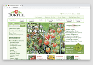
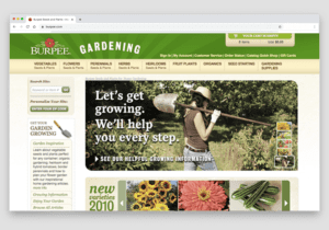
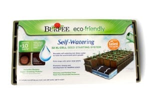
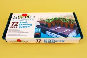
Our work covered all aspects of identity and communication for the brand. Working with Burpee’s in-house creative team, we oversaw the creation of catalog formats, web site development, direct mail campaigns, packaging, retail displays, email outreach, and social media initiatives.
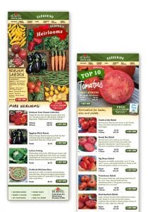
Catalog series. We redesigned the covers and interior formats to create a stronger editorial presence while maximizing the readability of the product listings.
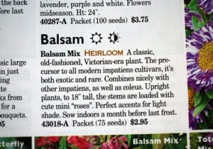
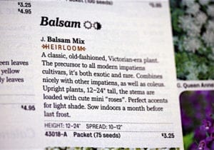
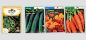
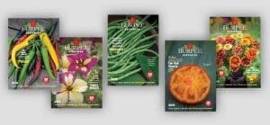
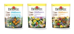
Before and after: We redesigned the seed packets to be simple and bold. The idea is to have them read almost as mini-posters featuring large, luscious images. The packets are color coded by seed type. We saw no need to take up space with a large logo; these are displayed in retail racks that have the space required do the heavy branding lifting. Paring down the content to essential elements provides a more dramatic presentation. Secondary information is relocated to the back of the packets.
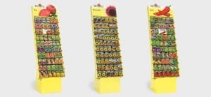
Our goal in updating the retail display program was to establish a stronger and more distinctive visual presence within a competitive and visually crowded environment.
When displayed in a retail environment, the simplified packet design produces a dramatic effect. We developed a range of nine unique display headers that could be read from a great distance.
Simple and consistent: The new visual approach has been applied to dozens of product lines by Burpee, their suppliers, and their partners, all following the same set of standards.

Poster design applied to the back cover of The Farmer’s Almanac
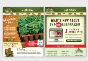
Product-focused email campaign

Designers
Alexander Isley
Angela Chen
Jamie Ficker
Matthew Kaskel