New York City
Mesa Grill
Building a bold brand We created the graphic identity for chef Bobby Flay’s legendary Mesa Grill.

The logo is a visual representation of a flat-topped mountain (or a table—take your pick). The look and spirit are echoed throughout menus, products, cookbooks, and marketing materials.
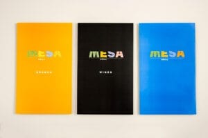
Our goal was for everything to reflect the bold spirit of the cooking, presented with passion and attitude.
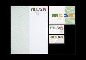
The stationery incorporates tequila, red clay, and lizard skin. (Or perhaps it's alligator skin... It was a while ago.)
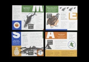
For a series of postcards announcing the restaurant's opening, we thought it would be nice to send out some recipes that Bobby wasn't able to fit into his menu. This follows our not-so-hidden agenda of rewarding the curious reader with useful information.
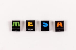
The idea continues through the design of the matchbooks.
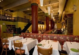
Interior of the original Mesa Grill on Fifth Avenue in NYC, designed by architect James Biber.
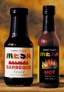

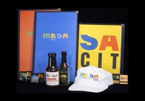
The visual approach was extended through packaging, menus, and promotional materials.


If it worked on the logo, why not on restroom signs?
A logo hasn't made it until it's on a cap.

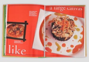
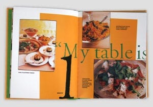
Cookbook for Clarkson N. Potter publishers. The big-and-bold visual approach extended through the design of the book.

Designers
Alexander Isley
Alexander Knowlton
Philip Bratter