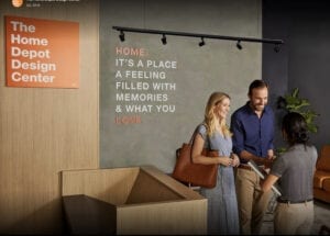
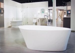
The Home Depot Design Center
Building a Second Home (Depot) We were commissioned by The Home Depot to brand and introduce a new division that focuses on the creation of customized high-end kitchens and bathrooms.
To align the division with the master brand we developed a logo based on the iconic Home Depot orange square, using a version of the brand’s existing Helvetica typeface.
Design fans will recognize that the visual sensibility owes a debt to Bob Noorda and Massimo Vignelli’s classic Modernist design program for the NYC subway system. (If you’re trying to suggest modern design to a new audience you could do worse than showcasing white bold sans serif type, arranged flush left within an orange square.) It’s simple and bold.

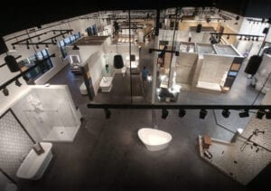
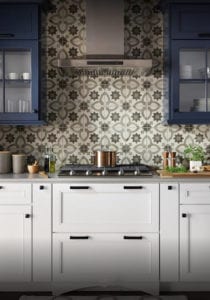
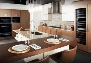
The Home Depot Design Centers are large-scale standalone showrooms that provide an extensive array of high-end appliances, fixtures, and custom design services to homeowners and design professionals.
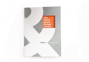
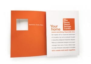
Our work included leading naming and positioning initiatives and the development of a comprehensive identity, environmental design, and communication program.
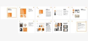
A comprehensive style guide provides inspiration along with the “rules and tools” to ensure that the brand’s visual voice is applied consistently across all identity and communication initiatives.


A fleet of delivery trucks, vans, pickups, and supervisors’ cars display the brand look and messaging.

Designers
Alexander Isley
Angela Chen
Shannon Stolting
Erika Back
Writer
Alexander Isley