Mexico City
El Palacio de Hierro
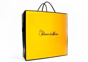
Packaging a store Identity and packaging program for Mexico’s leading group of luxury department stores.
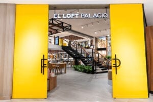
We incorporated the logo of the 130-year-old company into a new signature visual approach used in all identity, packaging, environmental design, and advertising.
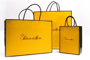
The cornerstone of the identity program is a distinctive yellow-and-brown color scheme, now used consistently throughout all advertising, retail environments, and communication materials.

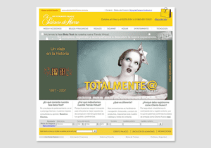
BEFORE: There was little consistency among Palacio's packaging, graphics, advertising, and web site.
AFTER: Our update — simple, bold, and distinctive — conveys a confident sensibility.

Testing the yellow. Our goal was to make sure the bags served as mini-billboards. We spent days on the streets of NYC and Mexico City with prototype shopping bags, sidling up to people who were holding Tiffany, Burberry, and Hermés bags. We wanted to make sure our design could hold its own. It could.
The new approach has been implemented by Palacio's in-house design team and outside advertising agencies.
Over the years and with consistent use, the yellow has become iconic, immediately signifying the Palacio brand.
Over the years and with consistent use, the yellow has become iconic, immediately signifying the Palacio brand.
Designers
Alexander Isley
Tara Benyei
Sara Bomberger
Recognition
Featured as a branding case study
in Fast Company magazine