Colorblends Wholesale Flowerbulbs
Behold: Big, bold, beautiful, bodacious bulbs We were asked by Colorblends, one of the country’s leading tulip bulb importers and sellers, to help position the company, focus their messaging, and create a new set of identity and communication materials.
Our mission was to find a way to suggest the excitement, optimism, and beauty that tulips (and all flowers, really) represent.
Colorblends occupies a unique niche: Working primarily with landscape architects and commercial garden contractors, the company develops and imports custom tulip blends. We updated the Colorblends logo, taking our inspiration from stenciled lettering on the sides of tulip bulb crates.
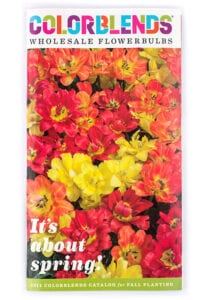
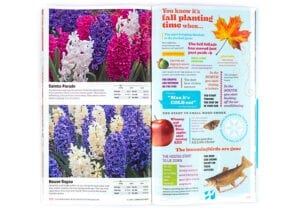
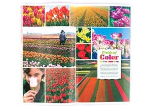
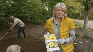
The catalog has a lot of fans.
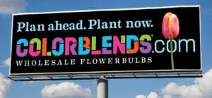
A series of billboards reminding consumers to order early and plant in the fall.
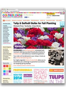
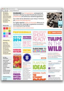
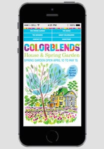
The web site was developed to be an efficient and informative ordering tool for Colorblends’ customers.
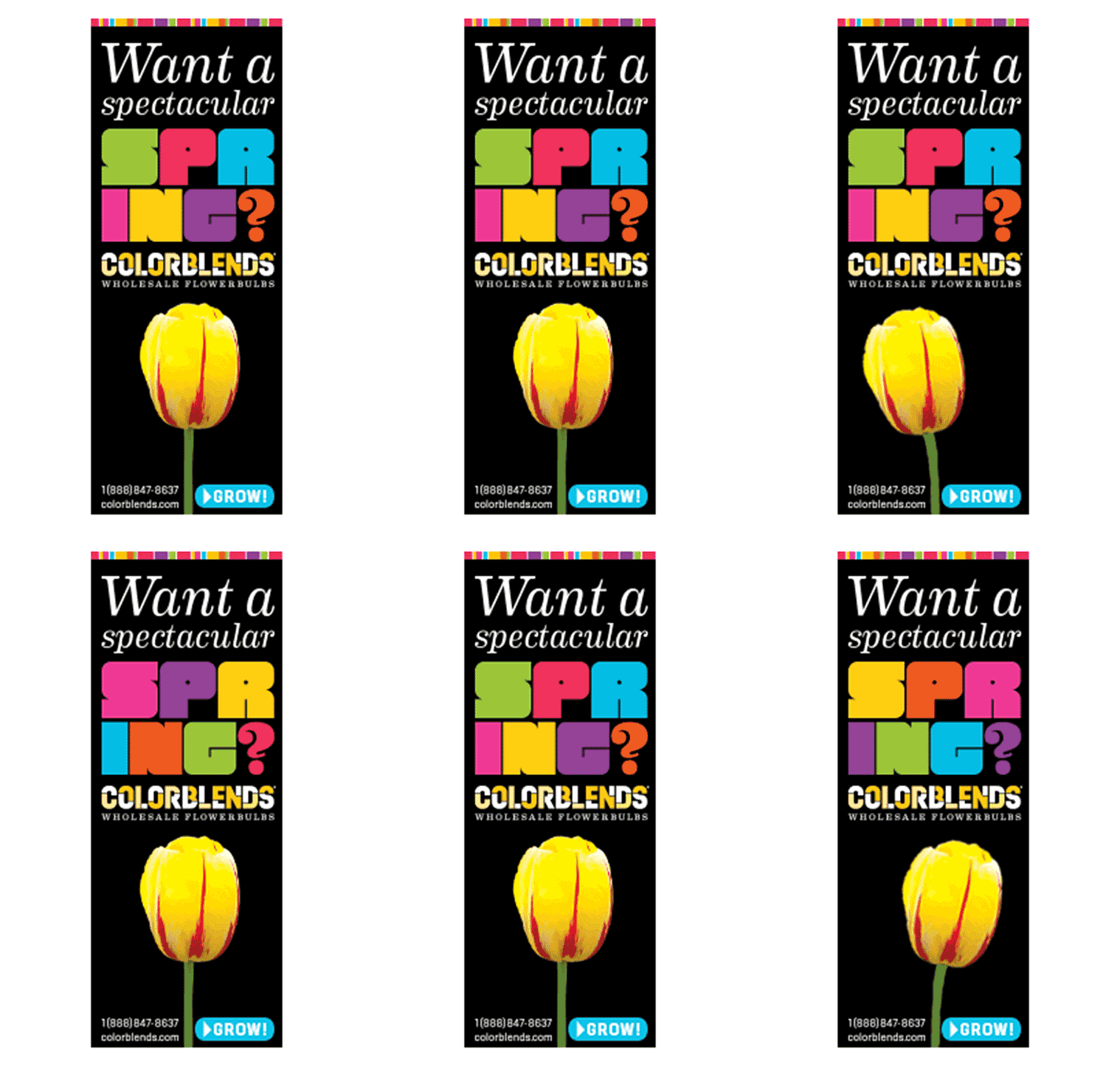
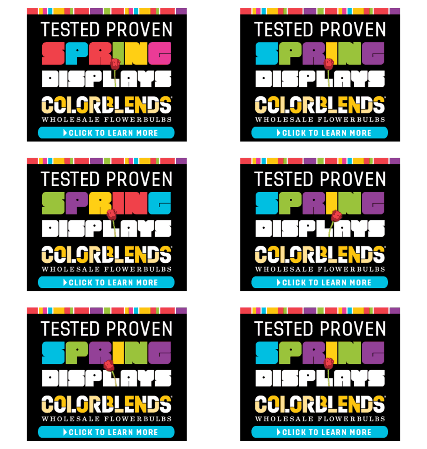
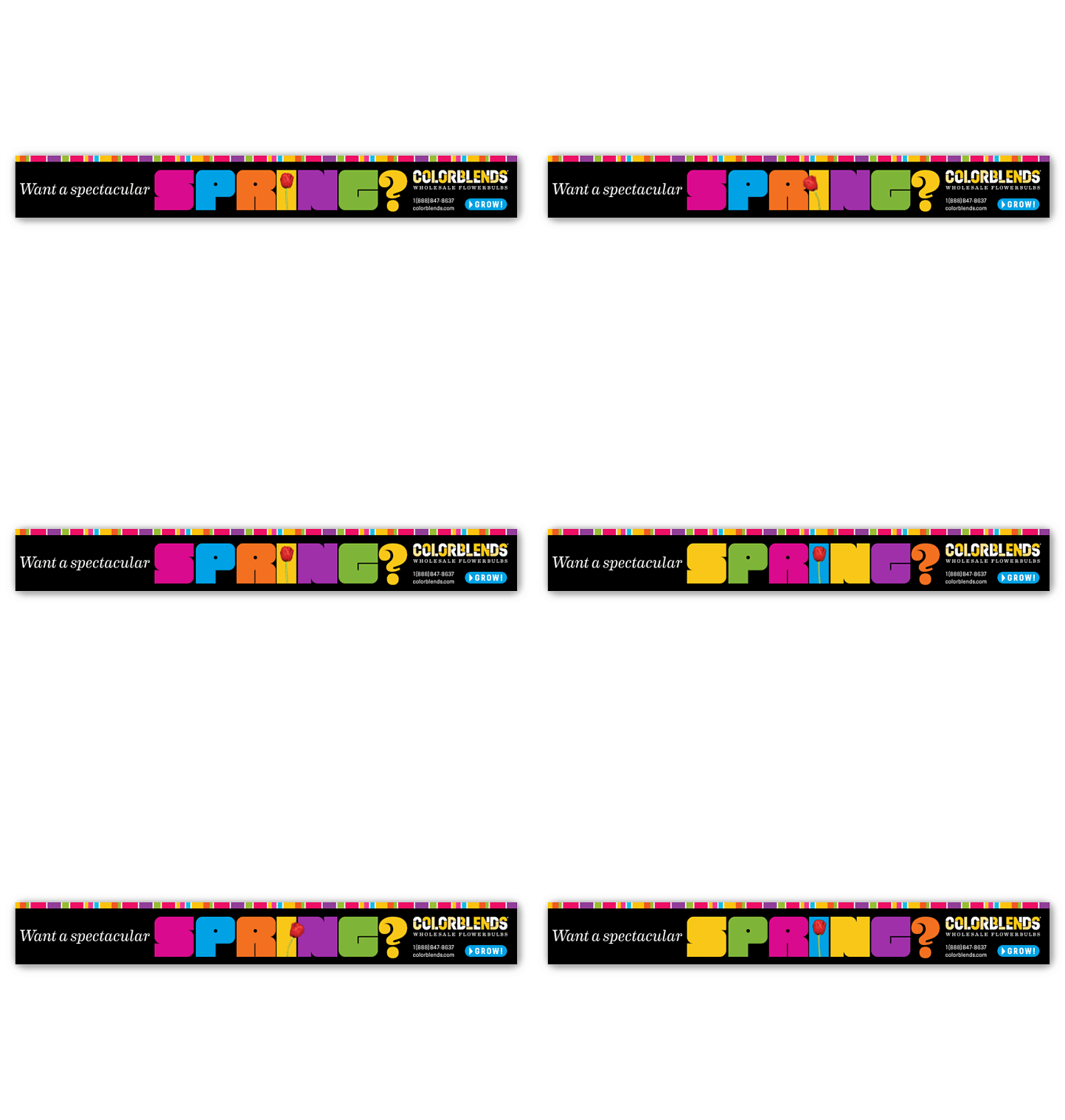
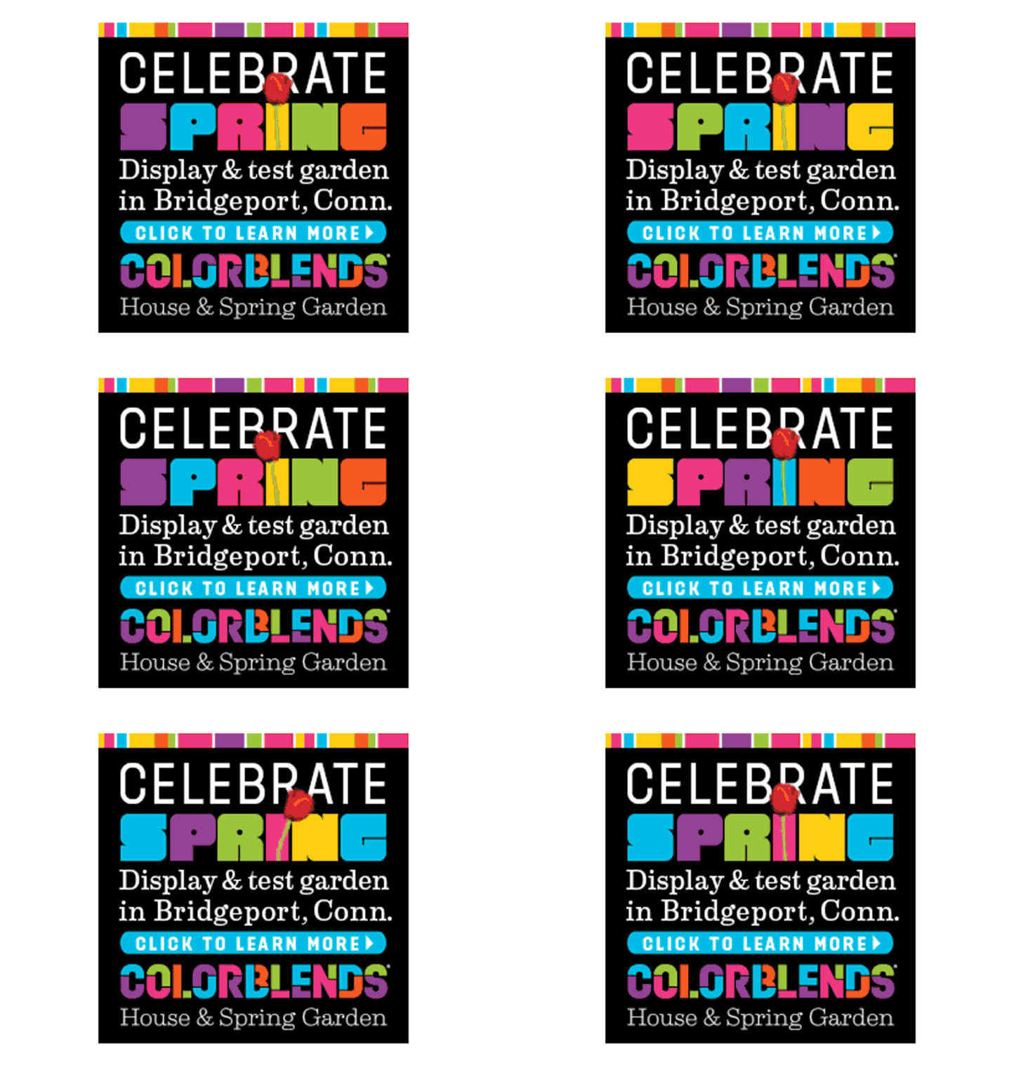
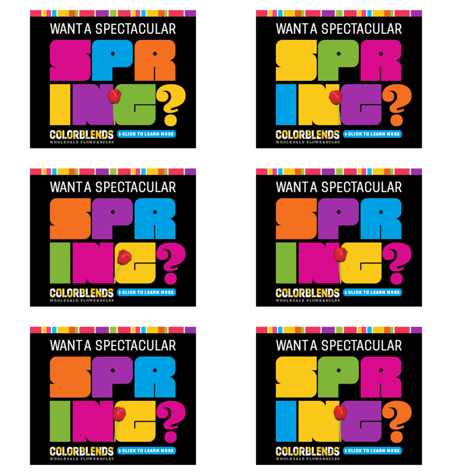
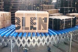
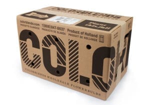
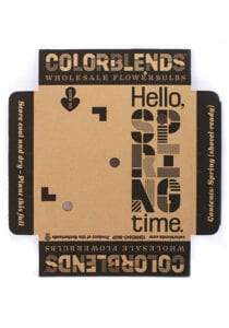
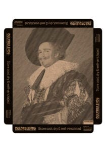
The shipping boxes provided an interesting challenge: How could we make something suggest colorfulness when we were limited to one-color printing?
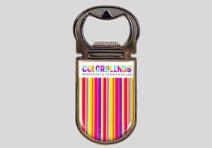
When in doubt, use a whole lot of stripes.
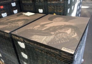
Speaking of stripes, here’s our design for the bulk shipping palette covers. We rendered the classic Frans Hals cavalier in a way that echoes the approach of the striped logo.

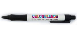
A logo’s only good if it works on swag.

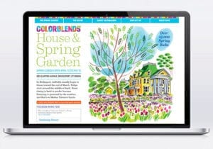
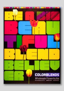
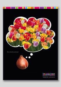
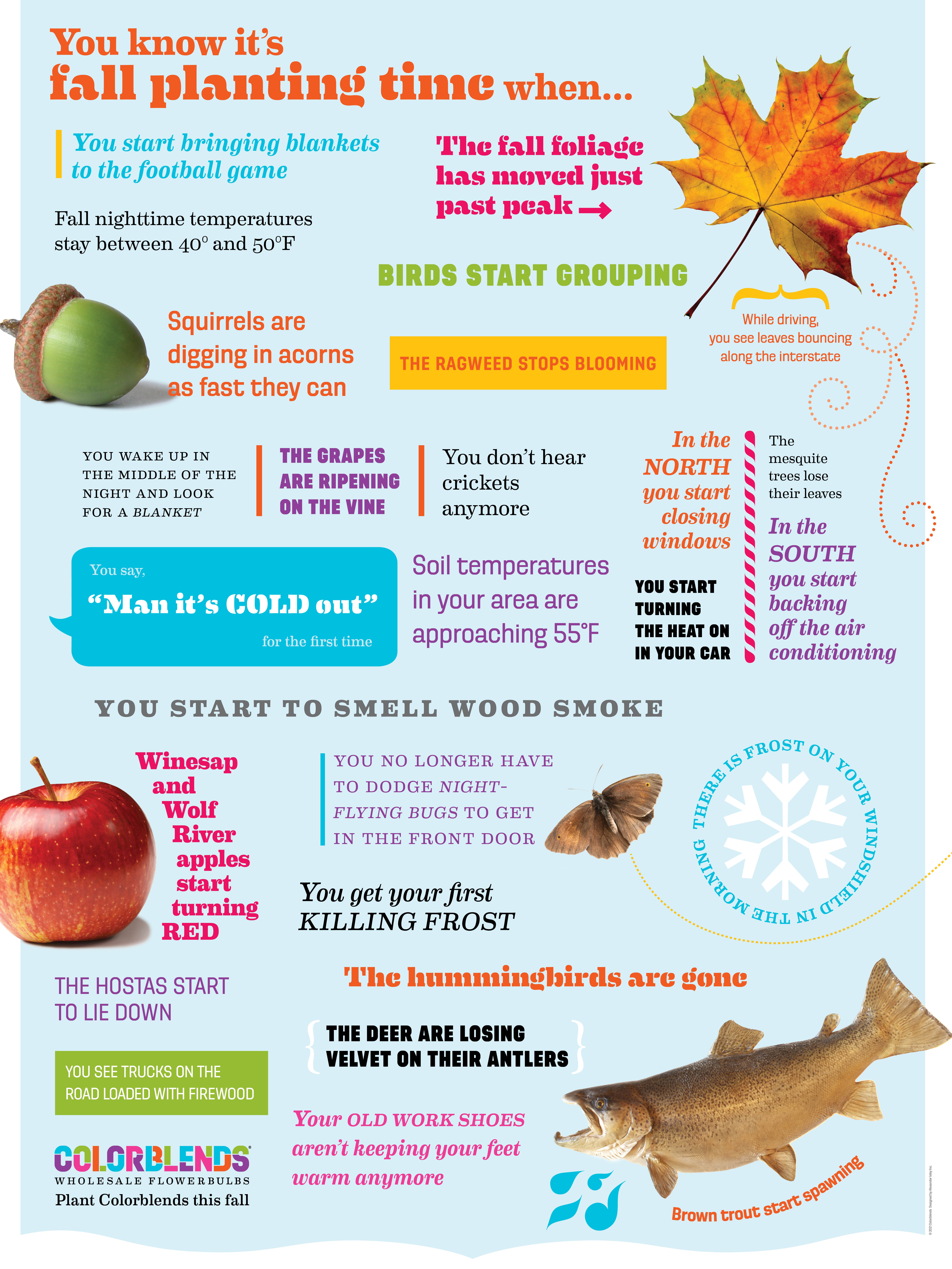
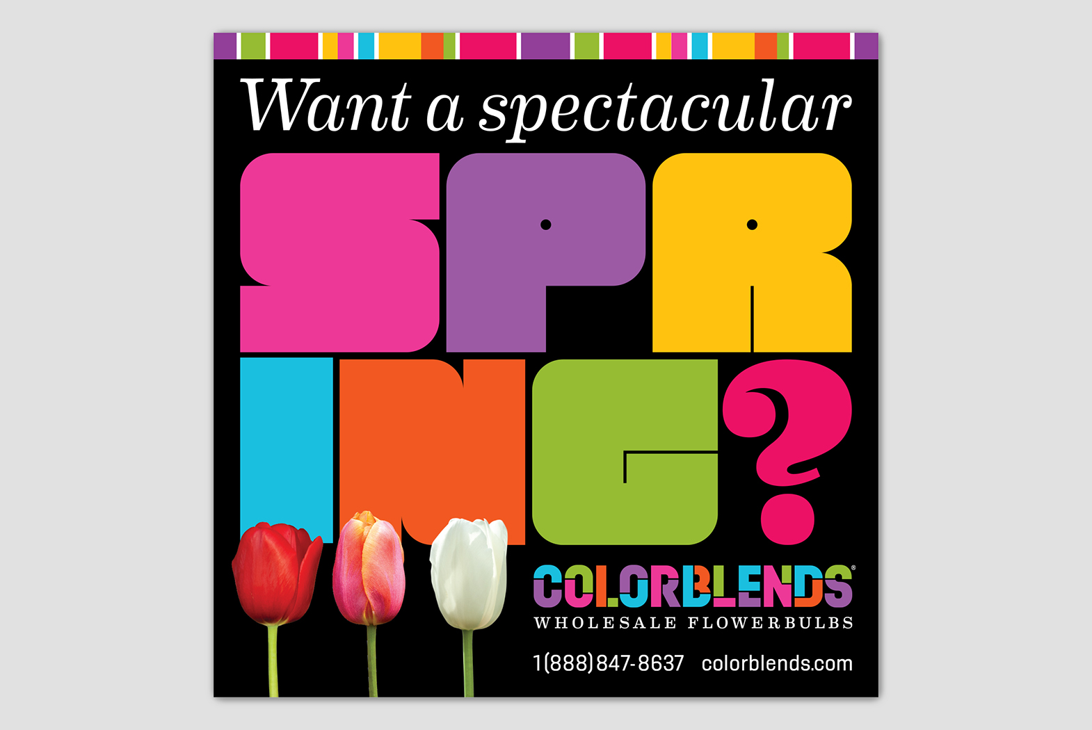
Every year we design a series of promotional posters distributed to landscape architects and contractors.
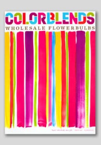
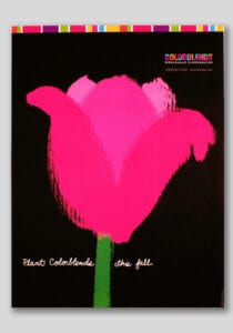
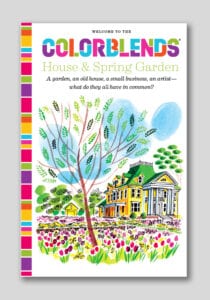
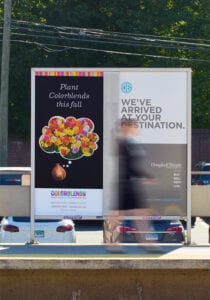
Informative brochure and consumer transit advertising
Designers
Alexander Isley
Erika Back
Angela Chen
Jennifer Merrill
Stephanie Trainor
Collections
The Herb Lubalin Study Center
of Design and Typography
Special Collections Research Center
NC State University Libraries
Museum of Design, Zurich