Rock and Roll Hall of Fame
It’s a long way to the top We were asked by the architects Pei, Cobb, Freed and Partners to develop the architectural signage and wayfinding program for the iconic Rock and Roll Hall of Fame.

It was an interesting assignment: When you think about it, Rock and Roll is about doing your own thing, pushing back against the system, and ignoring any instructions from The Man. Architectural wayfinding, on the other hand, is all about telling you what to do, where to go, and where to look.
Our challenge was to reconcile these ideas while working within the architects’ distinctive Modernist vocabulary.


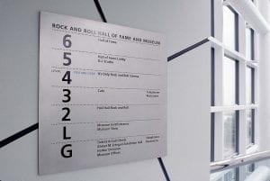
The configuration of the building is not particularly intuitive. We developed a simple system of “breadcrumb” markers that lead visitors to the Hall of Fame room itself, situated at the very top of the structure — just follow the numbers.
It’s a complex building, full of surprises. Our goal was to organize the information and be as simple and direct as possible.
OK, we admit we couldn’t hold back completely; some neon is involved.

The directory panels are straightforward, designed to convey location information clearly.
(To be honest, the best part of the project was listening to I.M. Pei explain to us the significance of Jimi Hendrix.)
Designers
Alexander Isley
David Albertson
Design Associates
Calori and Vanden-Eynden
Recognition
Interiors magazine