The Westport Library Environmental Design
A punctual design The Westport Library recently underwent a comprehensive “Transformation Project,” in which the building was completely re-envisioned as a multipurpose center of the community.
We were commissioned to develop an engaging environmental design, signage, and donor recognition program for the building.
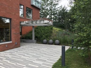
The entrance porticos feature custom extruded letterforms that spell out WESTPORT. (“West” reads toward the west, and “Port” overlooks the adjacent Saugatuck River.) The three spherical bollards help define the walkway and give a hint of what’s to come inside.
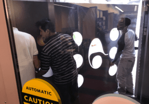
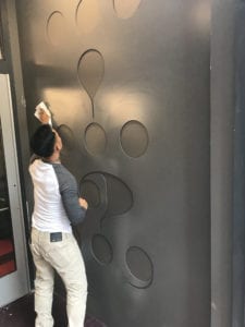
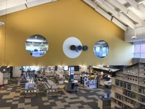
The ellipses suggest that there's more to come, and we took that as our departure point: How could we use punctuation as a technique to link up (and comment on) all the things that a library is, does, and can be?
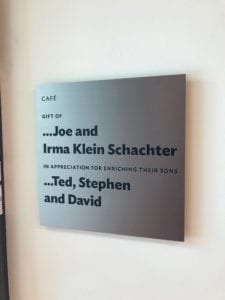
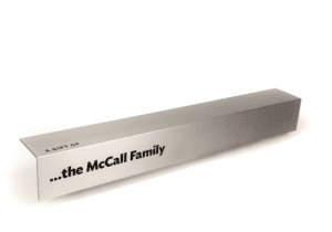
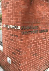
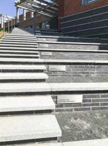
As part of our work, we developed a comprehensive donor recognition program. The main donor wall, adjacent to the main entrance, is a book-inspired dimensional structure that incorporates the names of all contributors to the fundraising initiatives.
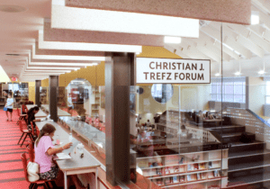
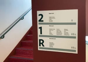
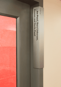
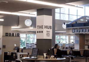
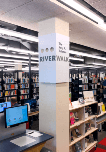
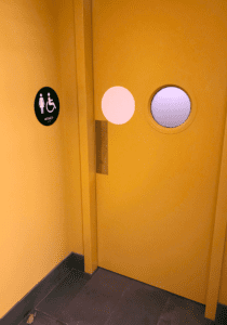
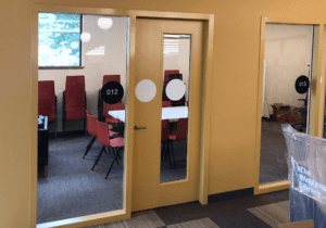
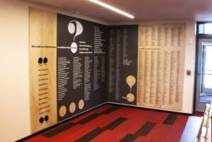
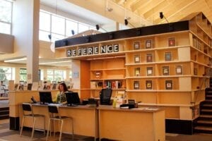
The library has a lot of interesting twists, turns, and corners where people and activities interact and intersect. We developed a series of signs that wrap around corners, columns, and door frames to suggest how words and ideas can meet in interesting and unexpected ways.


We worked with HMA2 Architects to develop a set of extruded letters for the library exterior.
Designers
Alexander Isley
Angela Chen
Shannon Stolting
Writer
Alexander Isley
Architects
HMA2 Architects
Recognition
2019 Society of Typographic Arts (STA) 100 Show award
2020 AIA Connecticut Citation-Contribution to Community Life award
Collections
Special Collections Research Center
NC State University Libraries